

Overview del projecte
The Hub is a new method of learning and practicing languages in a more natural, fun and realistic context. It is a community that brings people together to learn languages in close and trusted places: civic centers, libraries, schools, restaurants… They needed us to create a visual environment from scratch that would help them convey the character of the brand.

Learning languages is fun
We chose to identify The Hub with a gradient, which would allow us to define an infinite spectrum of colors. From here, unlimited subcategories could be born, each identified with a different color.
At the same time, such a wide range of colors reinforced the concept of a diverse and culturally rich community. The Hub is a transversal brand, for learning by sharing experiences in a specific context of use, such as music, cooking or sport.

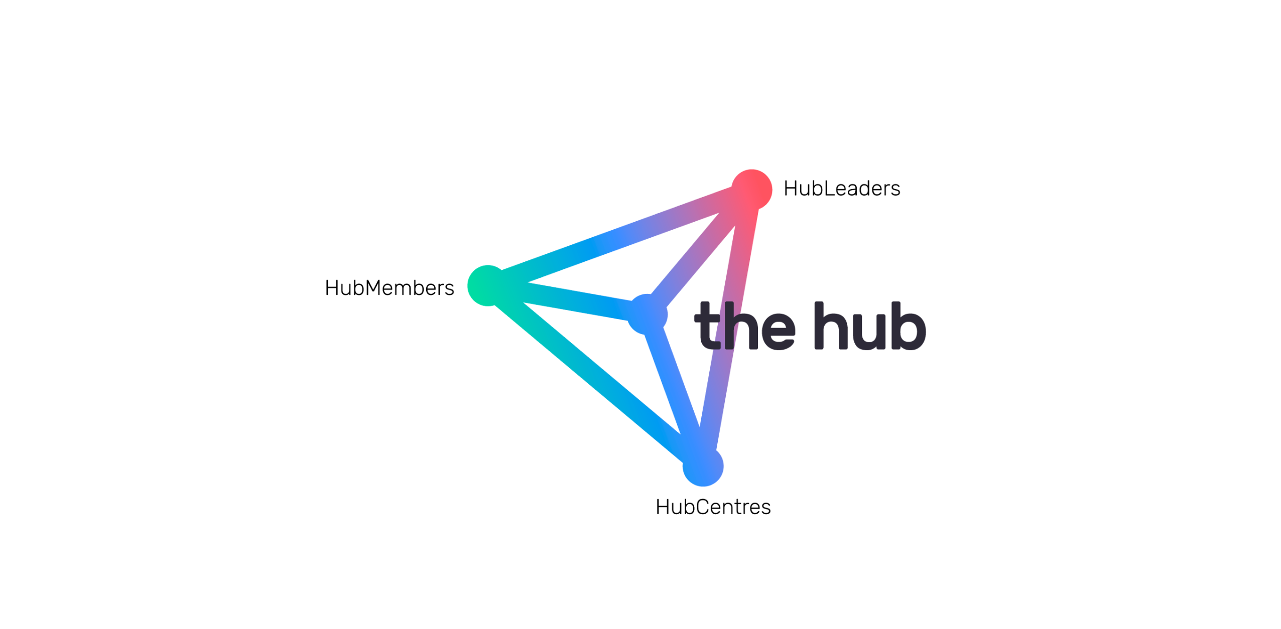
The RGB concept
We created the brand color palette with the RGB model in mind: red, green and blue are the three primary colors in light, and are the basis from which all other colors are formed. The Hub does the same, with the sum of three variables: students, teachers and spaces. It builds a whole universe of experiences and knowledge.
We opted for more vibrant and bright variants of these three colors, which helped the overall brand to be perceived as a modern, internet-based brand.
A brand that unites spaces, students and teachers
The Hub was a new brand, so we started this project from scartch. They needed a visual identity that embodied the values and concepts with which they identify.
On the one hand, they wanted to convey freshness, modernity and fun. On the other hand, concepts such as community, sharing experiences and exchanging knowledge. Our goal, therefore, was to create a brand that embodies all these concepts and helps to position The Hub.