Overview of the project
Rebugent is a construction company and real estate consultant with more than 50 years of history. A family business that wanted to maintain its essence but with the vision of new generations.
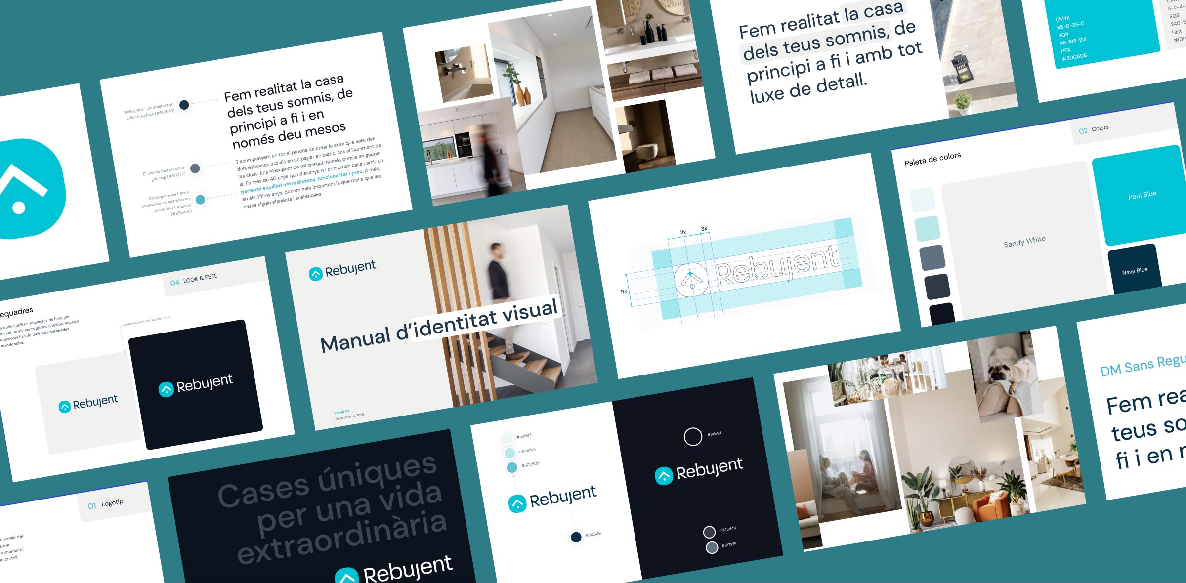
We have created a new brand and web identity that positions Rebujent as a modern company with a high interest on new construction techniques and sustainability.
Old logo, from the 00s
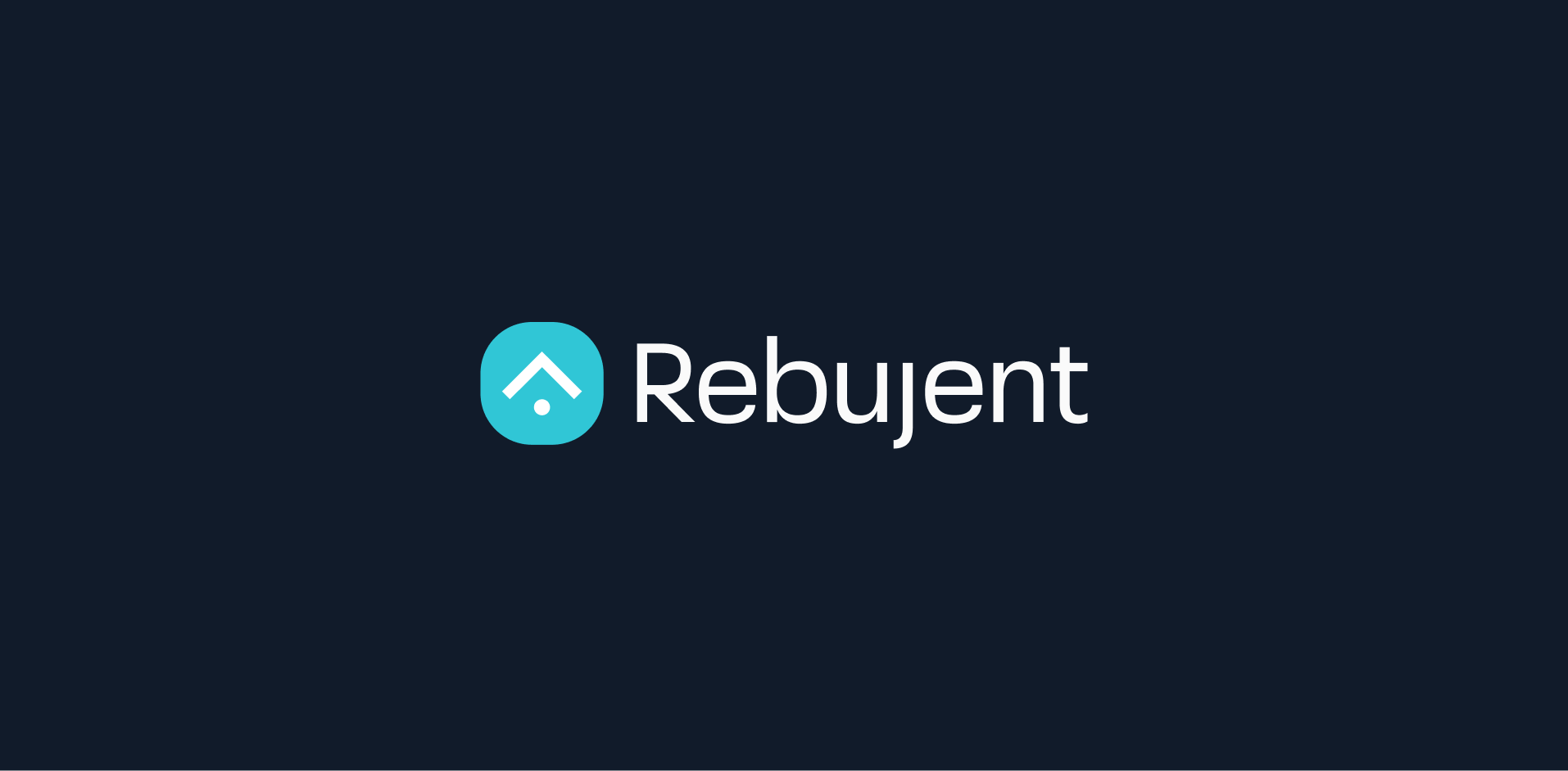
New logo
From literal to conceptual: modernizing the logo
The new brand identity is based on cleaner and simpler shapes. The symbol, now much more conceptual, is based on the version of 50 years ago. We used old-style construction tools as the main concept to design a house-like shaped logo.
Moving forward with respect for the past
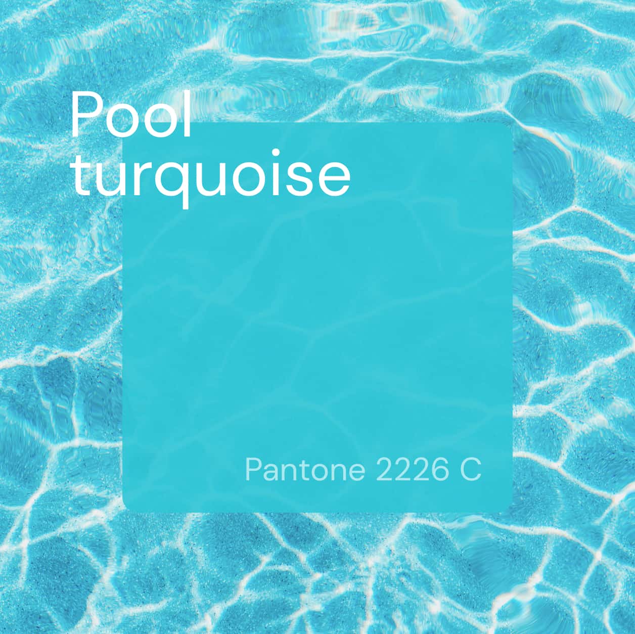
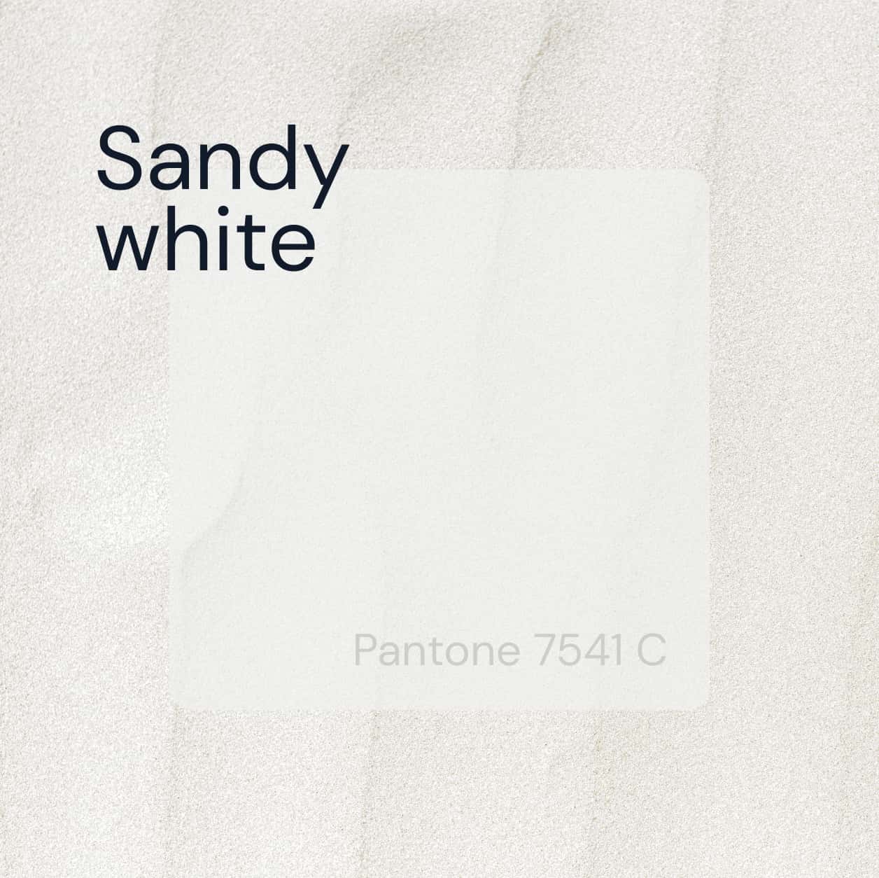
Rebujent is a brand that has already undergone several redesigns over the years. It was important that the branding remained identifying. That it respected, in a certain way, the chromatic range and the original idea.
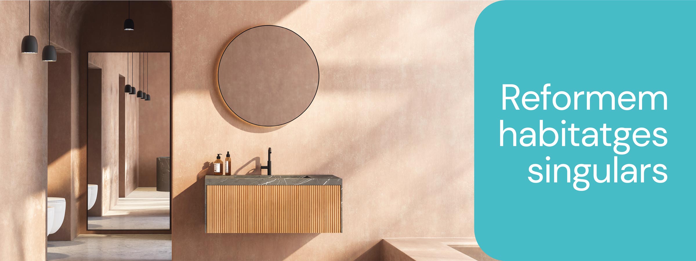
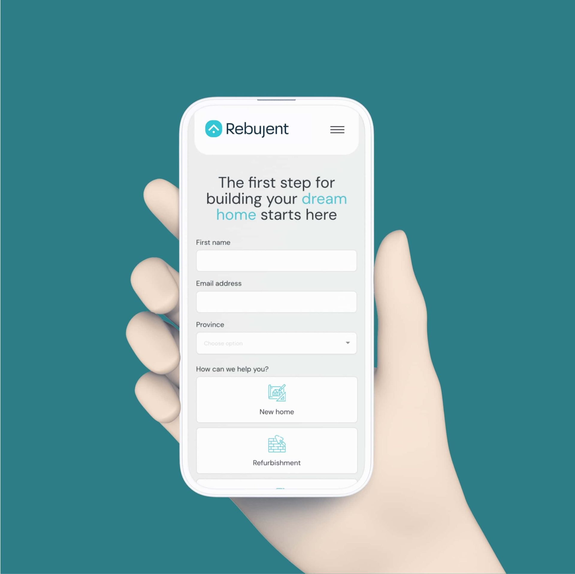
A new website that takes you to your ideal home
The UX/UI, the copywriting and the look & feel of the website main goal was to make you feel comfortable, as if you were at home. As if you were about to discover your new home or a new lifestyle to look up to. SEO was also a key aspect of this website. It had to be taken into consideration while writing all the content and structuring the website architecture.